Colors of Cubicles
The most common question I am often asked is “what is the best color for office partitions?”
It seems that a fair number of the clients haven’t decided on the colors of their furniture. I believe that some may not have an inkling that colors affect the moods of their clients and affect the productivity of their employees.
The most common colors in the office are white, beige, and grey.
There was a study done by a prestigious university in the USA that found colors alter the moods of people, and impact employee productivity.
Colors like gray and beige, for example, bring in emotions of sorrow and unhappiness. On the other hand, blue and green improve concentration and competence.
No wonder, then, that those big businesses have specific colors for their offices. They have even extended these colors to their logos, advertisements, and other paraphernalia.
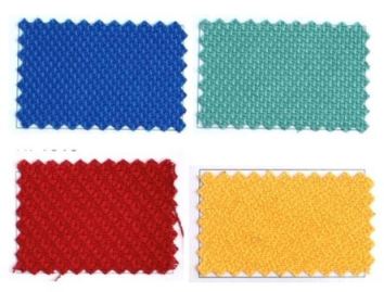
If you are thinking of installing dividers, partitions, and cubicles, then the colors mentioned below may help in your choice.
These are the main colors. The shades and variants could fall on these main colors.
1. Red
Now let’s start with Red. Dozens of studies support the theory that the color red raises your heart rate and increases your blood flow.
If the work in your office requires mental alertness and physical activity, you will not go wrong with the red color. This color is also associated with passion, strength, and energy.
Red is good in offices that work at night since this color increases brain wave activity, therefore doing away with drowsiness.
Red is great when your company is involved in construction and engineering activities.
2. Blue
How about blue? By far, this is the most productive color. Some say blue is for the intellectuals, the elites. Uhm… Really? Well, most of the industries we know are associated with the blue color: banks, accounting firms, consulting organizations, and the like.
A study done by the University of British Columbia even found that just changing the computer screens to blue produced employee output twice that of other colors.
I was thinking that the computer screen is just a small part of the environment. How much more if one is inside the blue cubicle?
Blue is associated with relaxing the mind, clearing thoughts, and easing mental tension. Light blue is the first choice in accounting offices. Wonder why? Accounting tasks are repetitive. There is the need to be focused and, yes, productive.
Blue is for tranquility, peace, and security. It is also associated with being orderly. Have you ever been to a business that seemed chaotic and messy? Did you notice the dominant color of their environment?
3. Green
Motivating people that work extended hours can sometimes be a challenge for management. Management wants results. It wishes its employees to stay focused on their specific assignments. That’s where the color green comes in.
Green is harmony. It does not burden the eyes. This color induces calmness and reassurance. If your people seem to be almost always swamped by the tasks you have assigned, then why not try changing the color of your office environment, the color of your partitions to green? This could probably help.
4. Yellow
Now comes yellow. Studies show this color promotes creativity. The yellow color is uplifting. If you are stuck and need some creative juices to flow, then try yellow.
You might not know it, but yellow is the strongest psychological color. You might argue that it’s red. But studies show it is such a powerful color when it comes to influencing the analytical side of the brain. Yes, the left side of the brain, where reason and analysis reside.
It is no wonder, then, that boosting your environment with this color helps employees retain information. Training rooms with this color, have been found to have their trainees absorb more information. One office I have visited have their tables and chairs accents of the color yellow.
There is, however, a caveat to misusing this color. Too much exposure can lead to eye strain. There was even one study that showed that long exposure to this color stimulates agitation.
5. Orange
The Welcome Color. It is a combination of red and yellow. When you think of red as the color that affects you physically and yellow influences you emotionally, then you have an orange that stimulates your mind and body.
Orange creates a sense of comfort and relaxation, of warmth. Most BPO offices choose this color to accentuate their lounges.
This bright color is sensed in business as being affordable, being of reasonable quality. You should be careful about using this color, though, as it may not jibe with the image that your company is pushing.
Also, the same study mentioned above indicated that while this color improved productivity with female employees, it did the opposite with males.
Color Preferences
The colors of office cubicles may be of less importance in the minds of some decision-makers. But get this, the world’s biggest and most innovative companies, like Apple and Google, take the color selection seriously.
The Google offices are exceptionally colorful. They are intentional in their preferences. Their color choices depend on what they want to accomplish. Like blue rooms, if they want their employees to create and yellow rooms when they want decisions made.
You may have your colors of choice, even variations, but these five are the predominant preferences in most of the offices.


